We’re thrilled to hear from you.
Our mailbox can’t wait to respond to your message.
We will get back to you very soon!
Have a great day ahead!
Your Bondroys
We hoped you’d land here.
Revolutionary b2b e-commerce platform
All-in-One ATS Recruiting Software
Service exchange app
Coming soon
Revolutionary B2B e-commerce platform
iFATIH converts real business to business experience into a friendly online platform.
It allows users to buy and even sell their goods.
The whole project can be divided into two main modules - Marketplace and Managing Application.
There are a lot of big features coming, helping business owners (not only!)
experience the platform in a time saving and effortless way.
We helped and are constantly helping to deliver design & strategy solutions
for the whole iFATIH product and admin panel to rule the product conveniently.
From the very beginning, we all knew this was going to be an exciting, yet challenging journey.
The client came with a lot of valuable ideas in mind. Our goal was to guide him through the
whole process, shape MVP, and help release the product.
Our goal was to create an intuitive, user-friendly product which would really help and
connect business owners and their customers by fulfilling the client’s vision.
We all know business owners don’t have time to waste and they need fast and flexible solutions, so providing a tool which saves their time is essential.
Effortless experience is the concept which guided us throughout the project. Combining it with a time saving approach makes it a perfect business combination.
As a platform which builds business to business relations and includes payment systems, having users' trust becomes another very important goal.
The main goal of the research was to gather information about the e-commerce market in Turkey as this would be the first market
where iFATIH will start. We investigated the topic having b2b in mind, conducting desk research, competitive analysis,
user surveys and interviews which allowed us to build user flows and wirefames. We present a fraction of the results below.
Turkey is the 20th largest market for e-commerce
with revenue of US$7.9 billion in 2019 and US$11.3 in 2020.
With an increase of 24%, the Turkish e-commerce market contributed to the worldwide growth rate of 17% in 2019. Revenues for e-commerce continue to increase. New markets are emerging, and existing markets also have the potential for further development. Global growth will continue over the next few years.
Market expansion in Turkey is expected to continue over the next few years. According to the Statista Digital Market Outlook, it has been predicted that, for the next four years, the compound annual growth rate will be 28%.
Past year-over-year growth was 24% which means the market is not yet saturated and still has growth potential. 40% of the Turkish population have bought at least one product online in 2019 which indicates
growth potential as well.
Fashion is the largest segment in Turkey and accounts for 42% of the e-commerce revenue in Turkey.
This is followed by Electronics & Media with 22%, Toys, Hobby & DIY with 18%, Furniture & Appliances with 11% and Food & Personal Care with the remaining 7%.
Defining the scope was one of the most challenging parts of the whole project. The client had a lot of features in mind with a perfectly pictured vision. We focused on crucial business and user needs, prioritizing them, and then shaping them into a product that can be implemented in a reasonable time.
On the left, there are some of the key features presented to rougly visualize what was defined. Obviously, we don’t cover every feature here, we just show the basics to give an idea of what the final scope looks like and how huge potential there is for the product to grow.
We have two areas for users’ and business needs. They have their own priorities and they overlap together to create released scope.
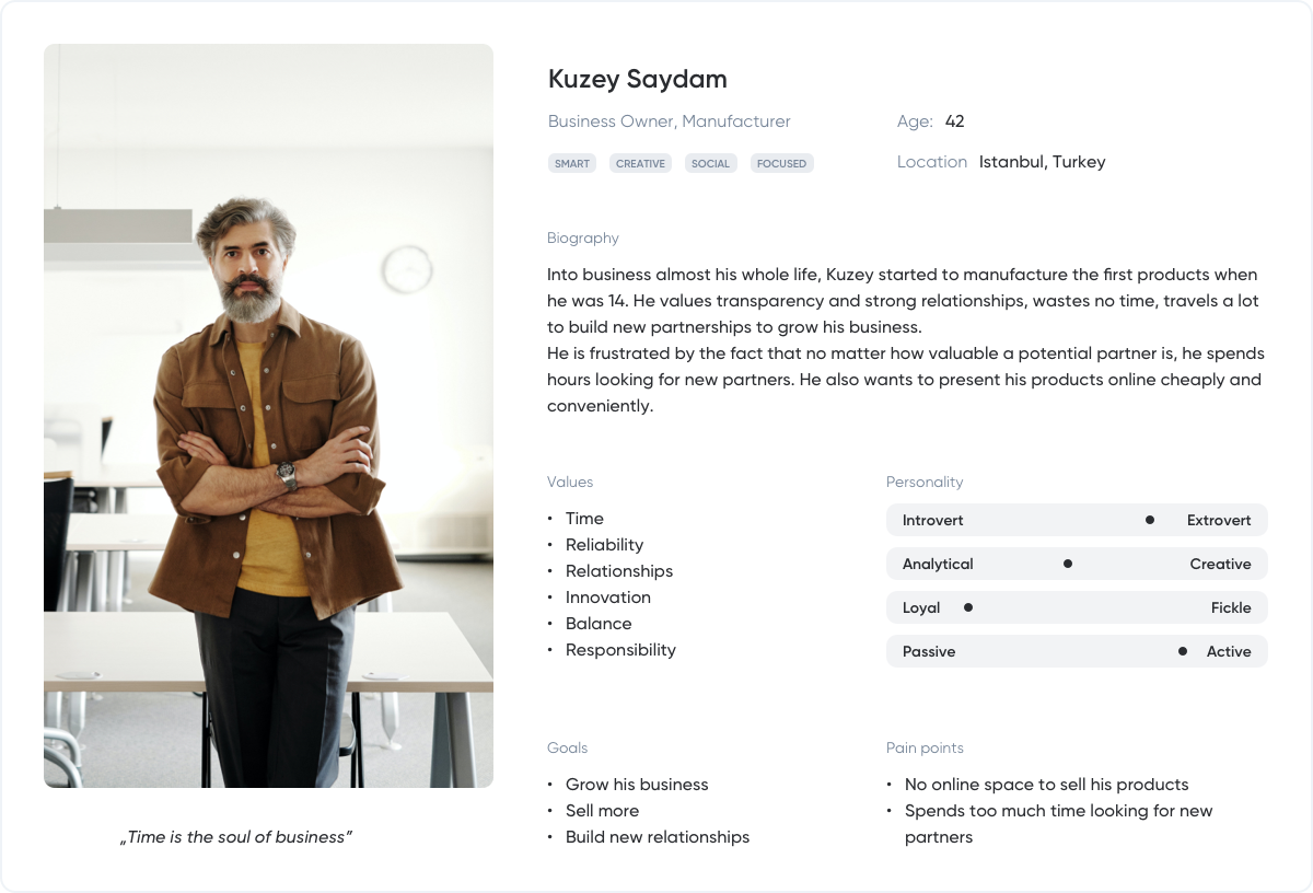
To gain better understanding of the future users, their needs and motivations, we have
created 2 personas. We present the main one below.
On the stage we’ve focused on keeping the user journey
smooth, pleasant and on top of that - effortless.
There were a lot of flows created and to optimise your experience, we present just a part of disputing flow.
We defined two types of users, Buyer and Seller. Obviously, Sellers can also buy products.
The whole project contains two main modules, Marketplace and Managing Application.
Apart from that, there is also an Admin Panel which we have also created.
We’ve created a lot of wireframes, which allowed us to conduct user testing sessions.
After a few rounds, we could move forward to the UI design phase with no doubts that
users will find the final product useful.
Along with the wireframes, we worked on visual iFATIH representation, starting from branding to
state fundamental principles which will later affect the whole digital product look and feel.
Based on core iFATIH assumptions, previously established wireframes and user testing sessions, we have built a whole
dedicated design system to meet future usage, flexibility and scale requirements.
iFATIH is supposed to be professional, attractive, and unique. Black and white combinations, supported by Orange Red
accents were chosen to meet those requirements.
To make sure the users' Orders will be properly distinctive, supportive colours were also needed.
Project uses only one typeface to maintain professional character,
follow minimalism rules and to keep best performance.
Components were built from scratch, not only to care about every pixel but to maintain consistency
across the whole platform. Chosing React as a main front-end technology makes it optimal to develop.
Here is just a sample of the still growing massive library.
The whole project project contains almost 300 screens just for desktop resolutions and is still growing.
Here are some of them and a walkthrough of the major features.
A proper place to browse users' past activity, review stats which are extremelly important especially for Sellers.
Before an order can be processed, the Buyer needs to send the offer so, the seller can review and then accept, reject or counter-offer. This can go back and forth until they reach an agreement.
iFATIH gives its users freedom to guide them through the process and let them include further details, typical for b2b.
Once Buyer and Seller reach an agreement and the Buyer makes payment, the offer goes to either Purchased or Sold and becomes the order processed by Seller.
iFATIH supports every transaction and gives its users the ability to dispute when something goes not as planned.
A crucial place for every Seller where he can add and configure every product he wants to sell.
There are also shareable parameters and document modules to share documentation mandatory for B2B transactions.
iFATIH users can exchange messages even before making an offer and later on as well.
For easier and more convenient payments, the user can save and re-use his debit and credits cards.
The user can sign up as a Buyer only or as a Seller and he can also buy. The buyer can always transform his account to Seller but he needs to provide his company details.
A great place to start your iFATIH adventure. Browse through tons of different types of products, sent and receive offers, contact Sellers and pay for your orders.
Users can leave their reviews after after completing a transaction. Buyers and Sellers can build their network based on past transaction results. It gives credibility and increases the quality of their business partners.
When reviewing the project we’ve identified the most important challenges
we and the client experienced.
After getting to know the users, their behaviors, and needs, we started to work on the scope. Having a lot of users’ needs and client’s wishes, we had to properly prioritize features and keep the scope short, compare it with development estimation to finally meet an expected deadline.
Firstly, we approached the overall experience in the traditional e-commerce model. In the middle of the UX design phase, the decision was made to reorganize the strategy and incorporate sending/receiving offers before the order could be processed. This change had a major impact on the whole iFATIH experience.
Creating a design system with rules and components that simultaneously meet brand guidelines, professional look and feel, best user experience, client’s expectations, easiness of implementation and finally, potential to future development was quite challenging.
Since the beginning of the development phase which we were comprehensively supporting, there were a few approaches to integrate different payment providers caused by technical dependencies and a lack of support from providers themself. All of that had significant impact on the user flows and presented information.